|
ACATS was my first logo for a mission in which I wasn't involved. I guess, my idea of having a logo for each
mission caught on and my boss, who like it, was a strong supporter for those logos. Unfortunately, if you do
logos for other people, you have to listen to their input and comply with specific requests and restrictions.
On those aircraft logos, I always had more fantasy in them initially, which I always ended up taking out.
On the other hand, a lot of other fantasy products got introduced, that I probably wouldn't have choosen for my
own logos.
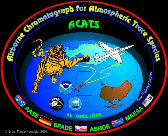
If you look at the content, you will notice that the tail of the tiger looks like an " a ", the tiger is a CAT, and the flight track of the airplane looks like an "S", together it forms A-CAT-S, get it? The mission went out of New Zealand and the ER-2 flew into the Antarctic ozone Vortex, that's why I decided to turn the earth upside-down and display the area of investigation. I'm sure that the Aussies and Kiwis didn't mind....ACATS, by the way, is the name of an instrument that was built in our laboratory at NOAA. Some more info on the mission: ACATS - the project.
|