|
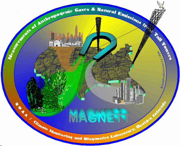
White background: because it's the first logo where I "broke out" of any regular logo shape. I was still bored by elliptical logos and decided to have something stick out. The tower gave me a good opportunity and also the idea for another bird in the logo: a nice, white owl, just settling on the tower to sh.. on our measurements (or something like that). It's also the first time I used transparent objects (CorelDraw 5&6) in the vapors that are drawn into the magnet. Together with the fractal backgrounds, this image is basically unprintable and, more importantly, impossible to put onto silk screen. I tried several times to create different versions of outputs, which all utterly failed. The image prints a 90 mb file and either comes out in weird colors, has random streaks or lines in it or simply prints in muddy colors on silk screen. I eventually gave up on it, although I know that some of the problems were due to a crappy CorelDraw 5 and I now have the knowledge on how to do it right, but the whole experience was too frustrating for me to continue on it.
Here's some more info on the project: MAGNETT - the project.
|